

As politicians from all parties don Wellington boots and wade through flooded fields and streets in southern England, the subject of climate change is rising up the agenda. While all but a very few have stayed away from direct attribution of the England floods to climate change, it is also clear that nobody has a good set of words that describe the current situation and the link, or otherwise, to the climate issue. Rather, politicians seem to be stumbling through the discussion, grappling for the correct language to talk about linkage but not to drift into attribution.
The starting point is somewhat loaded, in that the issue itself is now referred to more widely as climate change, rather than global warming. Although both have been part of the lexicon since the 1970’s, the climate reference has certainly won the day (Google Ngram Viewer, see below). It brings with it an expectation that change is underway, whether it is or isn’t for a particular location. Global warming more accurately describes the core issue, i.e. that the atmosphere / ocean system is warming in response to increasing levels of carbon dioxide, but it’s arguably less emotive and exciting. It also doesn’t fully describe the full scope of the CO2 issue. 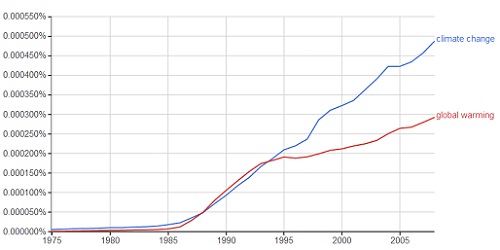
Exactly how and by how much the climate will change as a result of ocean and atmosphere warming remains to be seen, although a wealth of science, analysis, and computer modeling certainly doesn’t point to a static situation. Some locations may see very distinct and obvious changes over time, others may see very little. The problem is that we are all very impatient, whereas warming and its consequences will be a long, slow drawn out affair with mixed impacts on specific locations. As a result, the temptation to jump to conclusions is almost overwhelming.
The MIT Joint Program on the Science and Policy of Global Change has been actively exploring how best to talk about uncertainty. Perhaps their most successful tool is the Greenhouse Gas Gamble “wheel of fortune”, which tries to put the uncertainty around warming into terms that people can understand. The Joint Program website offers a nice tool where the reader can “spin” the wheel and see the distribution of results through to 2100, both under a business as usual scenario and with a robust set of policy measure applied throughout the world.

As the wheel is spun more and more times, a distribution emerges, which then gives some sense of the changes that may be in store for us. Most importantly, one feature of the “With Policy” case that is highlighted is the complete disappearance of the tail of the distribution, which in the “No Policy” case shows that very high temperature rises are possible. By contrast, even in the world where we take no action on climate at all, there is still some chance, albeit vanishingly small, that the temperature rise will be modest.

Tools similar to this could be developed for regional issues, such as precipitation in the UK, drought in Texas and heatwaves in Australia. They won’t be perfect, but may help in better understanding and more importantly, explaining what is going on. For example, even a historical distribution of precipitation for the winter period in southern England with the current winter shown would do a far better job in contextualizing the deluge we are aving, than vaguely saying it was a record and arguing that it might be climate change. A single point sitting several standard deviations away from an otherwise normal distribution would put it in the same category as the 2003 European heatwave, whereas a marginal outlier in a tight distribution might be viewed with less concern.
It may well be the case that the flooding in England is a result of enhanced warming from higher levels of CO2 in the atmosphere. Equally, it may just be part of the chaotic system we call “the weather”. Either way, a more informed discussion needs to take place, supported by data and helpful tools to unravel the messages contained within it.